
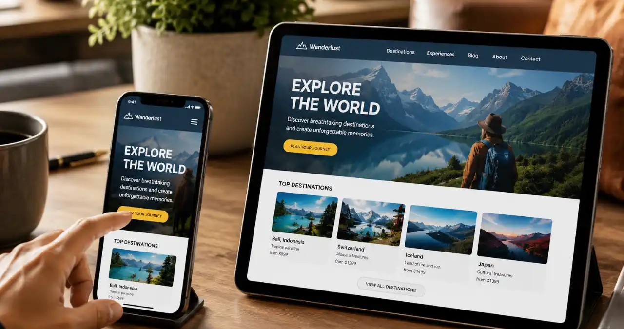

Creating a mobile-friendly website means that it shows perfectly and works easily on tablets and smartphones. Do you know how to make a website mobile-friendly?
Google basically applies mobile mode to websites, which increases rankings and helps with indexing. As the majority of users explore websites from their smartphones, it is essential to create a mobile-friendly website. It improves search rankings and the user experience. It augments the engagement and assists in conversions.
In this Ainewsjournal article, I will talk about the tricks to make a website mobile-friendly.
What is a Mobile-Friendly Website?
A mobile-friendly website is designed and optimised for mobile devices and is also perfect for desktops and laptops.
As people open a website on a small screen, they can easily see the content in the display. You can see the text without zooming. The visitor can tap the buttons using fingers. Basically, on a mobile-friendly website, users never encounter problems while browsing.
Why do We Need A Mobile-Friendly Website?
Every user needs a mobile-friendly website because of the following:
- Excellent search ranking: Google prefers mobile-first indexing. When the site fails to load in the right way, the position in the search engine falls.
- Better user experience: Text size, navigation, and layout make the site mobile-friendly.
- Improved sales and conversions: People want to get relevant information instantly. Besides, they want to buy quickly.
- Rising popularity of the brand: Customers hope to get a smooth experience irrespective of the device.
- Rival edge: When the website is tough to use on a smartphone, the visitors will abandon it instantly.
What Do Mobile Users Expect from a Website?
If you are using a mobile, you might have these needs:
- The mobile users might be searching for data, e.g. place, pricing, information related to the product, quickly.
- Page loading should be quick, even in slow networks
- The user can touch the form fields, links, and buttons easily.
- Sufficient spaces are present, and the content has proper length, which ensures the readability of the content.
- The visitor must be able to take the major steps, elements, and menus easily.
20 Ways to Make Your Website Mobile-Friendly (Step-by-Step)
1. Responsive Design
The layout of a website shows the text sections, images, buttons, and different elements. If you want a responsive layout, it is important to have readable text and clickable buttons. Choose the icons and images for various screen sizes. It must have CSS Media Queries, and the grid must be flexible. The design should show flexibility. The images can be expanded and contracted.
2. Keep navigation simple
People want to get the information quickly whenever they are searching for something. It is good to avoid menus or lengthy lists.
Never use excessive call-to-action on one page. People need a good contact form. Never use an extensive list of alternatives. The hamburger menu is great as it is a button showing a big menu.
3. Optimize typography and images
Body text should be 16px or bigger, which is really great for small screens. A range of 1.4 to 1.6 is perfect for line height. The contrast ratio of text-to-background is 4.5:1. It ensures that the reader can see the content under bright lights.
4. Improve site speed for mobile
It is important to keep the Core Web Vitals within limits. The largest contentful paint should be within 2.5 seconds. Use formats like AVIF or WEBP in the image format. It is highly recommended to minify or bundle JavaScript files.
It is essential to reduce the number of redirects and examine the web hosting plan. The loading has to be fast, and the browser must be free from caching and CDN. It must have Gzip/Brotli Compression. It is important to take out unused CSS.
5. Mobile-friendly forms
The form should be simple and short for mobile. The height of the form should be 44px, which helps the fingers to touch easily. On the website, we must keep the forms simple and short.
For general data, apply the autofill alternative, e.g., email address and name. The form should include input types like email, number, telephone, date, etc.
6. Prominent CTA buttons
The color, size and position of the CTA buttons should be ideal for generating revenue. It should have 48×48 px tap targets
7. Avoid pop-ups
Avoid sudden pop-ups and extra advertisements that control the content.
8. Avoid unassisted technologies
We have stopped using Flash, and it is highly recommended to use HTML5.
9. Give enough space in links
We need to tap on target spacing. Sufficient space helps in reading via mobile.
10. Apply viewport meta tag
The viewport meta tag assists the platform scale in the right way through various screen sizes. For example, check the following code:
<meta name=”viewport” content=”width=device-width, initial-scale=1″>
11. Keep content easy to read
- The bullet list helps in reading the text easily.
- The white spaces help in going through the passage.
- Small paragraphs is really beneficial to the reader.
12. Search function
People can search for the right information without browsing several pages on a mobile device. The user can stay motivated and get a remarkable user experience. It is important for e-commerce.
13. Assist in landscape and portrait mode
The biggest advantage of a mobile device is that it should be able to change between 2 orientations. A website can change from landscape to portrait easily, irrespective of holding the device. The platform should have a responsive layout.
14. Mobile-First Indexing
Mobile users find it really easy when the website has mobile-first indexing. As the majority of users explore a website from mobile, it becomes really easy for them.
15. Core Web Vitals
The website must have core web vitals like LCP, CLS, and INP
- LCP or Largest Contentful Paint: Checks the time taken for the biggest element to appear in the viewport, and it is generally within 2.5 seconds.
- CLS or Cumulative Layout Shift: Calculates whether the layout of the page shifts suddenly at the time of loading. Less than 0.1 is the threshold target.
- INP or Interaction to Next Paint: Calculates the time for visual improvement of a page in reaction to the steps of the user. It could be typing within the field or a click of a button. Less than 200 milliseconds is the target threshold.
16. Mobile SEO
Mobile SEO involves Mobile indexing, structured data, Mobile usability and local SEO.
17. Responsive Images
The mobile-friendly website must have srcset, and the picture must have the right size.
- Srcset: This attribute represents an extension in HTML for the <source> and <img> elements, which offers a list of various variants in the image file for the browser.
- Sizes: Size is another attribute that works with srcset. It informs the browser about the width of the layout.
- Picture: It is an element in a wrapper tag that permits the creator to add several sources of images.
18. CSS Media Queries
CSS Media Queries is a major feature in our responsive web design where we can use specific styles on the basis of the nature of the mobile, like screen resolution, viewport width, or the user’s choice.
19. Responsive Mode
A website in responsive mode shows a changeable layout, media queries, elements that are touch-friendly, scalable media, and adaptive navigation.
20. Google Search Console Mobile Usability
Google has actually closed the detailed reports on Mobile Usability along with the Mobile-Friendly Test tool. But the mobile usability indicates a ranking signal of the main page experience.
Common Mobile-Friendly Mistakes to Avoid
The errors in a mobile-friendly site are as follows:
- Small fonts
- Scrolling is horizontal
- Buttons are not clickable.
- The images are of a large size.
- Frequent pop-ups disturb the user.
- The layout has a fixed width.
Mobile-Friendly Website Checklist
The checklist for a mobile-friendly website is as follows:
✓ Responsive
✓ Navigation
✓ Testing
✓ Speed
✓ Font
✓ Images
✓ Buttons
✓ Speed
✓ Viewport
Effective Testing Plan for A Mobile Website
The right testing plan for a mobile-friendly website is as follows:
- Chrome DevTools: The browser testing tools include the Chrome DevTools and the responsive design tester, like Firefox developer tools.
- Lighthouse: Google Lighthouse is an open-source tool for testing a website. It checks the mobile-friendliness and SEO. This is the right tool for mobile usability auditing. It improves the score of the site between a scale of 0 and 100 and offers referrals for a really smooth mobile experience.
- Google PageSpeed: This is a tool which is completely free, and it calculates the live performance of a website along with lab diagnostics. It assesses the mobile experience of a site.
- BrowserStack: The platforms for cloud-based examination are Lambda Test and BrowserStack Live. BrowserStack represents a software testing platform using the cloud. It offers tools for checking the websites along with the mobile applications on different devices, operating systems and browsers.
- Real device examination: Carrying out genuine device examination for mobile friendliness is really important to find the touch-target problems. There are problems related to performance and rendering issues which the emulators might miss. It checks the exact way users communicate with the digital product in a real-life situation.
Guide to Auditing Mobile-Friendliness
| Auditing feature | Things to check | Right Habit |
| Readability of text | Length of paragraph, line spacing, and font size | Body text is bigger or 16px. |
| Size of tap target | Buttons should have the right space and size. | Tap targets should be 48 x 48 px. |
| Access to navigation | Usability and placement of menus. | Navigate using a single thumb. |
| Expanding image | Behaviour of the image on different screens | Apply responsive images |
| Loading time | Output of the mobile page | Reduce the image and decrease the CSS |
| Breakpoint behavior | Transition of design through screen width | Layout works easily on desktop, tablet, and mobile. |
| Form Usability | Flow of form completion and size of input field. | Apply big input fields. |
| Orientation testing | Nature of layout in portrait. | Guarantee the readability and usability of the interface in two ways. |
| Core Web Vitals | Media dimensions and mobile usability. | Create system font and bypass intrusive overlays. |
| Visual stability (CLS) | Unsized media and late loading fonts | Apply the skeleton screens. |
| Interactivity and Responsiveness (INP) | Form optimization and gesture support | Examine on genuine devices. |
| Viewport | Check the viewport meta tag and horizontal overflow. | Choose the mobile-first approach. |
| Mobile-first indexing | Content parity and structured data. | Compress images. |
| Pop-ups | Screen coverage and loading speed | Importance of user intent. |
| Responsive Layout | Touch targets and viewport meta tag | Choosing the mobile-first approach |
| Accessibility | Tap targets and text scaling. | Semantic HTML and logical reading order. |
Conclusion
Optimizing a website for mobile is the prime need rather than a comfort. Whenever the question comes up about how to make a website mobile-friendly, we must have mobile-first indexing, best ranking, a remarkable user experience, and improved conversions. We should never forget to optimize the page speed and test actively on different screen sizes. One can build an outstanding user experience and enhance the presence in search engines.
FAQ
How to create a mobile-friendly website?
In order to understand how to make a website mobile-friendly, we have to apply responsive web design, fix the viewport meta tag, improve the navigation, give importance to readability, and remove the popups.
What are the common mobile usability issues on websites?
The common problems of mobile usability are small touch targets, illegible texts, content has more width than the screen, irregular settings of the viewport, and slow loading times.
Do you think an app is better than a mobile site?
Select a mobile website when you give importance to an extensive reach and easy availability. Choose a mobile app when you need high retention of the user and sending push messages.
What do you mean by responsive web design?
Responsive web design is a method of development where one website reorganizes, reduces, or resizes the content automatically and works in the right way on every device.
Why is mobile-friendliness essential for SEO?
In SEO, mobile friendliness helps in increased user engagement, performance in local search, core web vitals, and mobile-first indexing.
How to check the mobile-friendliness of a website?
One can check the mobile friendliness using browser developer tools, Google Search Console, testing platforms, etc.
What do you know about mobile-first indexing?
Mobile-first indexing involves the content of the website in mobile mode. It includes content parity, technical setup, crawlability, mobile speed, and output.
What is the right font size for mobile?
For mobile, the best font size is 16px in body text.
What is the right format of image for mobile websites?
For a mobile website, the right format of image is AVIF, WebP, JPEG, PNG, and SVG.
Is it possible to turn a present website mobile-friendly?
The three ways to turn a website mobile-friendly are responsive web design, CMS plugins, and mobile-specific redirects.
How to create a mobile-friendly website?
In order to understand how to make a website mobile-friendly, we have to apply responsive web design, fix the viewport meta tag, improve the navigation, give importance to readability, and remove the popups.
What are the common mobile usability issues on websites?
The common problems of mobile usability are small touch targets, illegible texts, content has more width than the screen, irregular settings of the viewport, and slow loading times.
Do you think an app is better than a mobile site?
Select a mobile website when you give importance to an extensive reach and easy availability. Choose a mobile app when you need high retention of the user and sending push messages.
What do you mean by responsive web design?
Responsive web design is a method of development where one website reorganizes, reduces, or resizes the content automatically and works in the right way on every device.
Why is mobile-friendliness essential for SEO?
In SEO, mobile friendliness helps in increased user engagement, performance in local search, core web vitals, and mobile-first indexing.
How to check the mobile-friendliness of a website?
One can check the mobile friendliness using browser developer tools, Google Search Console, testing platforms, etc.
What do you know about mobile-first indexing?
Mobile-first indexing involves the content of the website in mobile mode. It includes content parity, technical setup, crawlability, mobile speed, and output.
What is the right font size for mobile?
For mobile, the best font size is 16px in body text.
What is the right format of image for mobile websites?
For a mobile website, the right format of image is AVIF, WebP, JPEG, PNG, and SVG.
Is it possible to turn a present website mobile-friendly?
The three ways to turn a website mobile-friendly are responsive web design, CMS plugins, and mobile-specific redirects.